Tuesday, October 16, 2012

Lighting Fixtures

Once we finished the lighting design, it was time to pick fixtures. Light fixtures come in all styles and at all price points. They range from your everyday light bulb to pendants which cost thousands. They range from traditional to ultra modern. The choices are overwhelming and, since fixtures are largely a matter of taste, our builder was able to provide less guidance than for other choices.

Fortunately, we didn't have to pick out each of the approximately 100 built-in lights in our home. The majority of the lights fit into categories, and the category requires only a single choice.

4" and 6" can lights installedYuval recommended LEDs for our basic can lights. LEDs are expensive compared to other bulb types, but Home Depot offers a reasonably-priced LED can light that uses Cree LEDs. These are some of the best currently available. They provide light at 2700K (a warm white, similar to incandescent bulbs), they are instant on, dimmable, low power, and have a long lifespan (listed at around 50,000 hours).

CFLs, the other obvious low power light option, have similar light quality, but they take a while to warm up, are not dimmable, and have a lifespan closer to 10,000 hours. Despite the higher price, LEDs won out due to instant-on and a long lifespan (not having to change lights in our 10' ceilings will be nice).

Light pattern from sconceYuval made a number of suggestions for wall scones to go in the stair tower, upstairs landing, and media room. We settled on the third of the linked options because it was a nice balance of style and affordability.

Track light against purple ceilingAfter evaluating the specific recommendations from Yuval and browsing online, we visited a few lighting stores to see fixtures in person. At Home Depot, we spotted a nice brushed steel and glass track light kit that we liked. Since we had quite a few of these in bedrooms and other rooms, we didn't want something too expensive; this kit was perfect.

At one of the store, we found an adjustable arm lamp to use by our bed. We ended up using these same lamps in the master bath over the mirror. We have a fairly thick mirror box built out which would have mostly blocked a standard wall-mount vanity light. The long arms of these lamps allow them to be positioned however we like relative to the mirror. These lamps introduced us to other lights by George Kovacs. We loved a powder vanity light from this brand, and another offering inspired the vanity light in the second bathroom.

Vanity lights in master bathSecond bath vanityVanity light when offPowder room vanity light

Because we are aiming for an energy efficient house, our exterior lights had to be surface mount. Normally the electrical box is set into the house, and the light mounts to that, but any penetration in the wall hurts efficiency. Because of this, we went mostly with the recommendations made by our builder and electrician, including these lights that mount on the exterior of the wall.

We wanted lights on the upper deck to provide soft illumination near the floor. We originally chose a small deck light, but this didn't work! Similar to other outdoor lighting, it uses a 12V electrical current. But these lights would be hardwired into our main 120V circuit. So instead we went with an inset step light in brushed nickel.

Upper deck lightLight from north, near the house
We have one light whose only purpose is aesthetic. We have a distinctive stair tower and our home is visible from a main boulevard down the hill. This inspired us to highlight the stair tower with light. After looking at a variety of options from Elemental LED, we chose this wall washer, which will be mounted in the backyard, pointed at the stair tower. It's very bright.

Living room pendant defining the living room
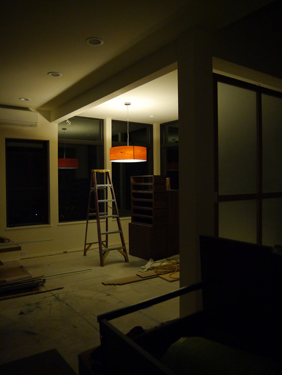
We have three pendants, each of which provides a major focus of it's location. Before construction started, Yuval found a stock clearance of some LZF lamps. We decided the Gea S looked nice, and purchased a large one in cherry. We originally planned it for the dining room. As work progressed, we realized we wanted a long dining table which would overwhelm the circular lamp. We also realized the lamp would compete visually with the stove hood on the kitchen island. We decided to move the Super Gea pendant to the living room.

After much searching, we stumbled upon this linear suspension pendant. We liked the minimal look and thought it would fit well with the linear table and kitchen. However, when we placed an order, it had been discontinued! There was one online store that still seemed to have stock, so we ordered it from them. It was not actually available, but could be specially produced in 9-14 weeks. This was longer than we were comfortable waiting for, so we switched to an alternative linear suspension lamp that was available sooner.

Dining room linear pendant

The remaining pendant is for the top of the stair tower. We were having a hard time finding something we liked that would look good above the stairs. But then Erika stumbled upon some inspiration. She decided to crochet a spherical lampshade to cover a simple pendant. First she acquired a rice paper lantern-style shade (made of nylon) to provide the shape for the yarn. Then we chose some bulky yarn in a burgundy similar to our bordeaux paint color. Finally I found a simple and cheap pendant that would provide the socket, cord, and ceiling mount. It has a simple attachment mechanism that will allow us to attach the shade to the pendant.

With those and a few other miscellaneous lights, our lighting is complete. We have good general illumination throughout, along with some distinctive lights to define spaces and add our style to the interior.

Sunday, October 14, 2012

Lighting Design

This post will get down to the nitty gritty details of lighting design. It's a complement to the general electrical design we covered in an earlier post.

Lighting design is complex — it is one of the areas where we had the most dependency on our build team for input. There are many issues to balance: ambient lighting competes with the desire to use light to define spaces, legal requirements compete with aesthetic desires, and the need to make decisions early competes with lack of available knowledge of how the space will look with drywall, paint, furniture, etc.

Overview
Yuval and Brent put together a general lighting plan, and we worked with them and our electrician to refine the plan. Although we had a lot of say in the specific fixtures we chose, we mainly followed the lighting plan given by them.

We have a lot of lights in our home. To give an idea, let's compare the three homes we will have lived in in 2012:
HomeBuilt in lightsArea (sq ft)Lights per 100 sq ft
Kirkland town home2516001.6
Bellevue town home1212001.0
New house10027003.7

Our new home has over twice the built in light density of other homes. Plus, unlike those houses, where the lighting was placed haphazardly, our new home has lights placed thoughtfully so that they both work well and look good.

Main floor electrical plan
On the main floor, we use can lights for for general illumination. They are also used to highlight some specific features such as the dining room wall (for art), the fireplace, and the kitchen island. Pendants in the dining room, living room, and stairwell will be used to provide focus and as aesthetic elements in their own right.

The detailed electrical plan for the main floor is below. You'll have to click through if you want to see any detail.


Lower floor electrical plan
The circulation areas on the lower floor use can lights. In the media room, we wanted to avoid penetrations that would interfere with soundproofing. Wall sconces provide general, low level illumination in the media room. Track lights provide bright lighting over the equipment closet and over the seating area.


Upstairs electrical plan
We relied heavily on sconces and track lights upstairs to avoid ceiling penetrations — here for heat efficiency rather than sound proofing. The few can lights used are 4" fixtures which are smaller than the standard 6" cans. The bathrooms use these lights to provide good, waterproof illumination, especially over the shower or tub. The bedrooms use track lights for general illumination; the landing uses wall sconces.


Switches
Placing switches is hard when there are 100 lights. The control we want — fine light groupings, three-way switches (which, confusingly, only have two switches controlling the same light) — requires more switches. But more switches make the lights harder to use. The switches also need to be usefully located.

While there are some rules of thumb to switch placement — e.g., no more than three switches per bank, three-way switches both ends of passage ways — many of the detailed decisions were based on advice from our electrician combined with imagining how we would live in the house.

Overall, our switches ended up fairly logical. Switches ended up in places that make sense when you want to use them — at entries and exits to spaces, on accessible walls, etc. We've been using them some as the house works toward completion, and we are slowly learning which ones are which.

Once the design is done, the next step is choosing the specific fixtures to be installed. This will be covered in the next post.

Saturday, October 13, 2012

Light and Space

Natural light is best for conservation and hard to beat for light quality, which is why our home has plenty of it. Artificial light is more than a necessary evil, however. It can be used to define space, and the fixtures can be beautiful details.

At the broadest level, light can be used to emphasize the social and functional structure of a home. Light should define how a space is used. Light should be usable.

So often, lighting is just an afterthought. Many spec homes have terrible lighting layout. The single ceiling light in the middle of the room comes to mind immediately. Lights are thrown in haphazardly without thought to how the rooms will be used or whether the light is sufficient. Or, perhaps, the builder does not want to dictate how the room will be used by some unknown future owner, so the light fixtures are added in a way that does not work well for anyone. Perhaps not surprisingly, the rooms with the best lighting design in standard spec homes are those that are the most specialized — kitchens, bathrooms, and dining rooms.


But how do you get good lighting? If we were to take a page from stores and office buildings, the answer would seem to be a large amount of uniform lighting. To some degree, this is a better alternative, but this approach increases functionality by making the space sterile.

Good lighting design must start with how a space will be used and work to support that usage.

Tapestry of Light and Dark (135)
  • Problem: In a building with uniform light level, there are few "places" which function as effective settings for human events. This happens because, to a large extent, the places which make effective settings are defined by light.
  • Therefore: Create alternating areas of light and dark throughout the building, in such a way that people naturally walk toward the light, whenever they are going to important places: seats, entrances, stairs, passages, places of special beauty, and make other areas darker, to increase the contrast.
  • In our home: Light is used to emphasize the main navigational points of our home. Some key examples are:
    Guiding lights in the entry
    Guiding lights on the stairs

    People also orient themselves toward the light and away from the darkness. This tendency can be used to define the social spaces in a home which we'll explore more in...

Pools of Light (252)
Dining room pendant

  • Problem: Uniform illumination — the sweetheart of the lighting engineers — serves no useful purpose whatsoever. In fact, it destroys the social nature of space, and makes people feel disoriented and unbounded.
  • Therefore: Place the lights low, and apart, to form individual pools of light which encompass chairs and tables like bubbles to reinforce the social character of the spaces which they form. Remember that you can't have pools of light without the dark places in between.
  • In our home: It's important to realize that this pattern doesn't mean that there should be full darkness between more brightly lit spots — although having darkness as an option provides some interesting opportunities. Our home has a generous amount of ambient lighting.
    Living room pendant
    But light should define boundaries. It should concentrate attention. And we should make sure that light defines the space in a way that is consistent with how people use it. If a brightly lit area does not correspond to a social or functional space, it will be confusing and less effective than if the light is designed around how the space will be used.

    Pools of light may be social or they may be used to provide task lighting. We have both in our home. We have task lighting in the kitchen, the bathrooms, and the dressing room. In the dining room and living room, the pendants define social spaces. These are not the only lights that support this pattern, but they are some of the key ones.

Filtered Light (238)
Filtered light in the powder room
  • Problem: Light filtered through leaves, or tracery, is wonderful. But why? ... Direct light coming from a point source casts strong shadows, resulting in harsh images with strong contrasts. ... These contrasts and hard boundaries are unpleasant — objects appear to have a hard character, and our eyes, unable to adjust to the contrast, cannot pick up the details.
  • Therefore: For all these reasons, we have a natural desire to diffuse light with lamp shades or indirect lighting, so that the images created by the light will be "softer," that is, that the boundaries perceived are not sharp, there is less contrast, fewer shadows, and the details are easier to see.
  • In our home: (I cheated a little with the problem statement and therefore. This pattern is primarily about light filtered through windows, but I chose some key points about general light diffusion.)

    One of the main ways we keep light diffuse is by having a large number of lights to provide ambient lighting. This provides a general background level of light which the pools of light shape further. The light fixtures themselves also have shades to diffuse light.

Warm Colors (250)
  • Problem: The greens and greys of hospitals and office corridors are depressing and cold. Natural wood, sunlight, bright colors are warm. In some ways, the warmth of the colors in a room makes a great deal of difference between comfort and discomfort.
  • Therefore: Choose surface colors which, together with the color of the natural light, reflected light, and artificial lights, create a warm light in the rooms.
  • In our home: This pattern does not say that every surface in the house must be between red and yellow. This is a good thing, since we have a rather large teal wall in our home. However, the overall quality of the light should be warm.

    We accomplish this partly through the materials we use — that teal wall is next to a warm floor in white oak. We also accomplish this through warm light. LED lights were a particular concern here since they often give off light that is cooler than that from incandescent bulbs. We went with EcoSmart LED lights in soft white. They give a warm light quality, very similar to incandescent lights.

In the next two posts, we'll go over the details of our lighting design and then spend some time discussing the light fixtures we chose.

Sunday, September 30, 2012

Master Suite

Our master suite has an unusual design. You enter into a dressing room that combines clothes storage with sitting space and space for getting dressed. The bathroom is on one side of the dressing room. The bedroom is on the opposite side and is sized just right to fit a bed. There is no walk-in closet or access directly to the bed or sitting and writing space next to the bed. Nor is the bathroom directly connected to the bedroom. Deliberate considerations informed these choices, as explained by these three patterns.

A Room of One's Own (141)
  • Problem: No one can be close to others, without also having frequent opportunities to be alone.
  • Therefore: Give each member of the family a room of his own, especially adults. A minimum room of one's own is an alcove with desk, shelves, and curtain. The maximum is a cottage. In all cases, especially the adult ones, place these rooms at the far ends of the intimacy gradient, far from the common rooms.
  • In our home: The master suite is the private place for us. It is distinctly separate from the kids' bedrooms. It is also at the far end of the intimacy gradient, well away from the common areas. An important part of this is that the master suite is more than just bed, bath, and closet. The dressing room is also a sitting room. We will have a couple of comfortable chairs and a small table. It will be a cozy space we can retire to individually or together.

Bed Alcove (188)
  • Problem: Bedrooms make no sense.
  • Therefore: Don't put single beds in empty rooms called bedrooms, but instead but individual bed alcoves off rooms with other non-sleeping functions, so the bed itself becomes a tiny private haven.
  • In our home: While not strictly an alcove, our bedroom was inspired by this pattern. The bedroom portion of the master suite is just a bed with a pair of nightstands. It has no closets, chairs, or desks. There are two reasons it is a room instead of merely an alcove. The first is for privacy and isolation. A full room allows the bed to be separated from the dressing room, so mismatched patterns of sleeping and getting ready won't disturb the person sleeping. Secondly, a larger bed meant for two is awkward to access from only one side. A room allows a pathway and nightstand on both sides of the bed for convenience.

Dressing Rooms (189)
  • Problem: Dressing and undressing, storing clothes, having clothes lying around, have no reason to be part of any larger complex of activities. Indeed they disturb other activities: they are so self-contained that they themselves need concentrated space which has no other functions.
  • Therefore: Give everyone a dressing room — either private or shared — between their bed and the bathing room. Make this dressing room big enough so there is an open area in it at least six feet in diameter; about six linear feet of clothes hanging space; and another six feet of open shelves; two or three drawers; and a mirror.
  • In our home: The solution to this pattern is the most prescriptive of the three. It is also the one that we followed most closely. Our dressing room has a comfortably-sized open area in the center that allows easy movement. The southeast corner has two walls full of clothes storage: hanging space, shelves, and drawers. Under the windows, we have a dresser to provide more drawers. On the west wall, we will have a full-length mirror.

These patterns describe the major points of philosophy behind our master suite design. They guided us to a layout that is uncommon but surprisingly natural at the same time. We have already received many comments along the lines of “Oh! That is a good idea.” when showing off the master suite. We hope it will prove to be as convenient as the design suggests.

Sunday, September 16, 2012

Interior Color

Modern architectural style allows for two colors: black and white. That, at least, is the stereotype. But color is an important element in setting the mood of an interior, and paint is one of the cheapest ways to make a dramatic statement. We wanted to use color as a decorative element in our home.

Choosing the colors
The first step was choosing a color palette. We started with some options that our color designer put together for us. We chose a fairly complex palette: 5 colors, including Martha Stewart's Terra Rosa.


We experimented with many different combinations of colors from the choices Anne had put together for us. While there were some combinations that didn't work together, overall, we would have had a difficult time choosing a palette we disliked from the choices we had.

Eventually, we decided that bordeaux and slate teal (the main middle and right colors above), were our two must have colors. The lighter purple (dreamy) and lighter blue (saratoga springs) each on their own left the palette feeling a little unbalanced, so we decided to use both as approximately harmonious lighter shades of the purplish bordeaux and blueish slate teal. When we were onsite deciding where to use the colors, we decided to throw in terra rosa. We wanted something a little brighter and more energetic for the laundry room.

Using the colors
Once we chose a color palette, we got to decide where to use it.

Window frames
We chose to go with dark window frames on the interior. The dark trim, which matches the frame color on the exterior, both accents and minimizes the window frames. The dark trim really pops against the white walls, but it is actually less noticeable than white trim when looking through the windows at the view.

Dining room accent wall
We wanted the dining room wall to be a splash of rich color to help define the dining room as a separate region within our open space and to act as a frame for a couple pieces of frameless art that we plan to put on that wall. Our color designer, Anne, likes to always end color on an inside corner so that it doesn't feel like it suddenly died. From that, we got the idea of treating that wall as if it were a teal block penetrating the room. We even continued the color inside the entry closet to really emphasize that effect.


Powder room
We had conceived of the powder room as having a dark grey accent wall to contrast with the slightly golden tan tiles, but when it came down to choosing the wall, we couldn't decide which one to paint. Instead, we decided to take a risk and paint the whole powder room dark, ceilings and all. The effect is dramatic, but we think it works.

Bedrooms
We chose not to use any paint in our bedroom, but we wanted to have a little fun in the secondary bedrooms. These two bedrooms are are nearly identical, so we wanted to use color to differentiate them. From Eve Ashcraft's The Right Color we got the idea of painting the ceiling and closet interior as a way to add color without making the color as overwhelming as it would be if all the walls were painted. We made the east facing bedroom the morning room and accented it in blues. The evening room is accented in purples.


Laundry room
Laundry rooms can be boring, so we wanted to use color to give the room some energy. We decided to do this using two accent walls in a bright coral color. Because colors tend to look brighter and lighter when painted on a wall, we went with terra rosa, which appears a bit subdued in small quantities. As the picture below shows, it's anything but subdued when you paint two walls with it.

Media room
We wanted the media room to be fairly dark so as to minimize reflection from stray light when we are watching movies. Given our palette and tradition, the obvious choice would have been bordeaux. Dark rich reds go with theaters like bright reds go with sports cars. However, one of our inspiration photos had been a dark blue room, so we decided to use the slate teal for the walls and ceiling of the media room. We paired this with dark trim to create a room that will enclose and embrace its occupants.

By using color selectively, we've been able to add some interest without taking away from the clean, refined look we are trying to achieve for the house.

Monday, September 10, 2012

Doors and Trim

Doors and trim may not be the sexiest part of a house, but without them a house won't look finished.

Tall trim is popular now, but we didn't feel it was the right look for our house. We wanted something minimal. Our trim is about one inch tall and not quite as deep. We debated between a wood finish to match the floor or white painted trim to match the walls. We chose the painted version, partly because it was a bit cheaper.

The electric outlets on the main floor are low and oriented horizontally to continue the clean look. With white paint on all of the doors, trim, and windowsills, the trim pieces almost disappear. The door handles are simple but elegant in a silver metal.
White trim
There were some exceptions, of course. Our dramatically dark media and powder rooms called for dark trim and doors. The trim in rooms with tiled floor is also tile. The exterior doors have dark bronzed hardware instead of the silver used inside.

Dark door in media room

Most of the doors are normal hinged doors, but there are some exceptions. The media room door has weatherstripping to help isolate sound. The toilet closet in the master bath has a pocket door (sliding door in the wall) to keep it compact. We eliminated the pantry door completely to make access easier.

Other than the entry door, which got a post of its own, we had three doors that we wanted to make more interesting. We wanted to add interest to the main floor and upstairs landing, and we wanted doors that would stay out of the way when they are open (which we expect them to be most of the time). For these locations we chose barn doors — sliding doors mounted on the wall so that they slide in front of it.

Translucent doors allow light through and complement a modern aesthetic. One appealing option was 3form, their Varia Ecoresin comes in a variety of colors, textures, and patterns from inserted materials. We also considered doors from The Sliding Door Co., which has a variety of simpler designs.

Ultimately our favorite option was frameless frosted glass doors with prominent hardware from the Sliding Door Co. The hardware is a bit industrial-looking but also sleek and modern. Upstairs, we matched the doors to the kids suite and the master suite even though the openings are different widths. The identical doors in different positions (one nearer the stairs and one farther) provide a nice balance.
Office barn doorSliding door hardware, with rubber stops

The sliding doors provide impact in a few key places, while the rest of the doors and trim serve to finish the edges in the house without drawing too much attention. Perhaps more exciting, once you get to trim and doors, you know you're approaching the finish line!

Sunday, September 2, 2012

Shaping rooms

Before we dive into the design of specific rooms, we have one last post on the general layout of the house.

The Shape of Indoor Space (191)
  • Problem: The perfectly crystalline squares and rectangles of ultramodern architecture make no special sense in human or in structural terms. They only express the rigid desires and fantasies which people have when they get too preoccupied with systems and the means of their production.
  • Therefore: With occasional exceptions, make each indoor space or each position of a space, a rough rectangle, with roughly straight walls, near right angles in the corners, and a roughly symmetrical vault over each room.
  • Room shapes on the main floor
    In our home: This pattern took us awhile to understand. The authors start by implying rectangles are bad and end by saying rooms should be roughly rectangular! The key to understanding this pattern lies in the discussion between the Problem and the Therefore.

    This pattern is all about making rooms feel comfortable. What shape should a room have? The room should be convex. Concave corners feel awkward unless they define a separate space such as an alcove. The room should pack well with other rooms. Unless it's an exterior room, this almost always means that the corners will be roughly 90 degrees. These two constraints lead to roughly rectangular rooms.

    Room shapes upstairs
    But why the hate for crystalline squares and rectangles? Rooms should be rough rectangles, but they don't have to be exact. They don't have to follow strict proportions (e.g., square, golden ratio) or relate in such a way that a perfect grid could be laid over the floor plan. The rooms should dictate their shapes, not some imposed ideal.

    Our home is made up of rough rectangles, freely arranged and mostly free from non-alcove-defining concave borders. Rooms were sized and placed based on their functionality, not according to any system.

Corner Doors (196)
  • Problem: The success of a room depends to a great extent on the position of the doors. If the doors create a pattern of movement which destroys the places in the room, the room will never allow people to be comfortable.
  • Therefore: Except in very large rooms, a door only rarely makes sense in the middle of a wall. It does in an entrance room, for instance, because this room gets its character essentially from the door, but in most rooms, especially small ones, put the doors as near the corners of the room as possible. If the room has two doors, and people move through it, keep both doors at one end of the room.
  • In our home: We don't have a lot of doors in our home, but their placement in the room generally makes sense functionally — mostly in corners and, when not, placed in a way that makes sense for the individual rooms. Instead of highlighting all of our doors — you should be able to find them yourself from the floor plan (main, upper) — we want to focus on a particular room where, guided by this pattern, we moved a door to make the room much more effective.

    Our dressing room is fairly small space (roughly 10' x 12') that has three doors. Placing the doors without creating dead, unusable spaces proved to be something of a challenge. The architect had originally placed the doors as pictured below on the left. This turned most of the south wall (the lower wall, in this image) into a pathway and made the south east corner difficult to use. We ended up losing about half the room to pathways.

    After framing (but, thankfully, before much else was in), we realized how awkward this would be. We modeled the room in Sketchup and tried different door placements. It quickly became clear that the placement in the image on the right is much more usable. The path still divides the room — this is inescapable given the placement of the rooms, but it divides the room into two areas large enough to be useful. The area in the lower right, which is along interior walls, will be our dressing corner (the large brown boxes are shelving). The area in the upper left, which is near the windows, will be a sitting area. There is a bit of an awkward corner in the upper right, but it fits my dresser perfectly.

    As this example illustrates, the door placement can make a huge difference in the usability of a room.

Dressing room doors, before
Dressing room doors, after