Showing posts with label inspiration. Show all posts

Sunday, February 3, 2013

Stairs

Unless stairs are hidden away, they cannot help but be a visual focus. And a modern, custom built home is pretty much required to have visually intriguing stairs. As far as we can tell, building the stairs is also required to put the house behind schedule. Our home is no exception on either count.

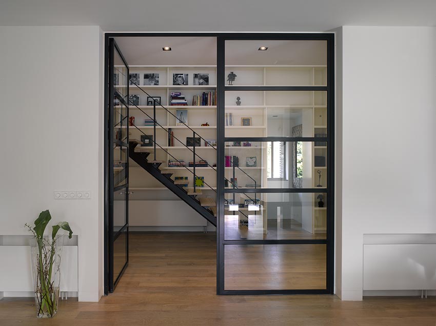
We consciously chose to push the stairs into a prominent position that made them more functionally and visually central. The process of designing the stairs differed from much of the rest of the house. We were deeply involved with most elements of our home. For the stairs, we provided some inspiration pictures and some input, but largely trusted our builder to come up with something we would like.

Staircase as a Stage (133)
  • Problem: A staircase is not just a way of getting from one floor to another. The stair is itself a space, a volume, a part of the building; and unless this space is made to live, it will be a dead spot, and work to disconnect the building and to tear its processes apart.
  • Therefore: Place the main stair in a key position, central and visible. Treat the whole staircase as a room (or if it is outside, as a courtyard). Arrange it so that the stair and the room are one, with the stair coming down around one or two walls of the room. Flare out the bottom of the stair with open windows or balustrades and with wide steps so that the people coming down the stair become a part of the action in the room while they are on the stair, and so that people below will naturally use the stair for seats.
  • In our house: We partially implemented this pattern. We placed our staircase in a central location, and we made sure that it was a space in its own right, with nice wide landings (which we plan to develop into window seats). However, a semi-translucent wall, and the way that the stairs protrude from the building keep the staircase from being fully integrated with the main living areas. A person coming down the stairs may be part of the action in the dining room, but they are almost completely cut off from the living room (although there is a "spy hole" that allows limited interaction).
Stair Seats (125)
  • Problem: Wherever there is action in a place, the spots which are most inviting, are those high enough to give people a vantage point, and low enough to put them inaction.
  • Therefore: In any public place where people loiter, add a few steps at the edge where stairs come down or where there is a change of level. Make these raised areas immediately accessible from below, so that people may congregate and sit to watch the goings-on.
  • In our house: Our stairs are not actually good stair seats. They are fairly wide, but not wide enough that they can be used for getting upstairs and sitting on at the same time. They are fairly deep, but not deep enough for most people to comfortably sit sideways on. A structural column keeps them from protruding into the room, so they don't provide a good vantage point. Thus, it speaks to the power of this pattern that even though our stairs were not designed as effective seats, they are still used as seats when we have large crowds over.
Staircase Volume (195)
  • Problem: We are putting this pattern in the language because our experiments have shown that lay people often make mistakes about the volume which a staircase needs, and therefore make their plans unbuildable.
  • Therefore: Make a two story volume to contain the stairs. It may be straight, L-shaped, U-shaped, or C-shaped. The stair may be 2 feet wide (for a very steep stair) or 5 feet wide (for a generous shallow stair). But, in all cases, the entire stairwell must form one complete structural bay, two stories high.
  • In our home: Since we were working with a team of an experienced builder and architect, we were not in danger of doing anything terrible here. However, we did find that our initial estimates of square footage always forgot to account for the stairs, and the stair area on the floorplan always felt larger than they needed to be. There is, indeed, something about the three dimensional volume of a staircase that makes it hard to grasp intuitively.

Inspiration

Shortly after purchasing our property, we started to collect inspiration pictures (alas, this was before Pinterest, so our inspiration pictures were managed by a Google doc). Without trying, a number of themes emerged, and we worked them into our final stair case.

Although the most stunning stairs were the ones with little to no visible support of the treads, when it came to visible supports, a number of our inspiration pictures had dark supports with light treads. Others had light supports with dark treads. The contrast and rhythm provided by contrasting treads and supports would become a central theme.


One thing you may notice if you spend a lot of time on architecture blogs looking at modern houses is that they generally have impractical rails and balusters. These homes are clearly somewhere with less stringent building codes than Bellevue, WA. Fortunately, we were able to find some inspiration images that met the requirements imposed on us by the city and our desire not to have people fall through the stairs.


The vision which inspired us, even before we started thinking about the practical constraints, was long bars which spanned multiple levels of stairs. We liked how having a single bar span multiple levels tied the levels together to make the staircase a single sculptural piece.


We had other inspirations, but these were the features that stuck as we turned this into something real.

Actuality

There are a lot of practical constraints that go into stairs. Local codes constrain most of the distances between elements, available materials constrain what is cost effective to use, practicality of assembly constrains how elements can be put together. These practical constraints had as much influence on the final form of our stairs as our inspirations.


To complement the material choices throughout the rest of the house, we chose to contrast wood and metal. The railings, balusters, and supports are all blackened steel. Steel is also used for the bars between treads, which ensure that nothing too large, such as children, can fall through.


The treads are a 1" oak slabs, each made out of smaller pieces of oak, bonded to a dark stained piece of plywood. We ended up really liking the rhythmic effect of the alternating light and dark lines, but this was almost accidental. Brent, the onsite manager for the first part of construction, found some nice, relatively cheap, solid white oak treads at Home Depot. These needed to be made thicker to support the necessary span, so each tread was reinforced with a piece of high quality plywood. The plywood is set back and darkened to give a stronger appearance of floating to the lighter oak.


Codes and assembly also influenced the tread design. Because of the constraints on tread overlap, each oak tread had to be lengthened by about two inches. After that, each tread had to be precisely sized to work with the balusters. Overall, the additional labor balanced initial low expense of the materials, but the result is visually more interesting than solid slabs, and it is unique among the staircases we have seen.


Another practical difficulty was figuring out how to assemble the balusters, rails, and treads. The balusters are 16 foot steel rods which span three half-flights of stairs. By code, The maximum distance between balusters is 4.5", and they need to be attached to the stairs for structural stability. Because of the differences in floor-to-ceiling height between the main and lower floor, the number of treads per half-flight varied, making alignment of the balusters difficult. To make assembling this puzzle easier, Yuval and Brent decided to attach the balusters to the stairs using stainless steel standoffs. These standoffs screwed into the sides of the treads, which was easier, more stable, and risked less damage than drilling through the treads. The standoffs provide a nice contrasting visual element. Getting the standoffs in the right location was a puzzle that took Dave, who was leading the effort, several days. He had to mark each standoff location with masking tape, use a laser sight to figure out where the corresponding standoffs would go on the lower levels, mark those, and then move on to the next one. Occasionally, the max 4.5" distance between the steel rods would mean that a standoff would have to go in a position that could not be securely attached to a tread. At that point, that standoff would be adjusted, which led to all the other standoffs that had been placed so far needing adjustment. The precision paid off, and after getting everything marked up, they were able to install the standoffs and slide in the rods pretty quickly.

Overall, we are quite pleased with how the stairs turned out. The use of white oak and steel integrates them with the rest of the house, while the tread and baluster design adds a unique, sculptural touch.

Sunday, May 29, 2011

Inspiration: Glass

Glass is an ubiquitous element in architecture. Every building, no matter what it is made of, uses glass to draw in natural light. Light brings heat, and too many windows will bring too much heat.

Windows provide a view from the interior to the exterior world. They provide connection without being a true portal. You can look, but are still separate.

In these cases, glass is used as an invisible element. It provides protection and separation from the exterior world, while bringing in light and views. From an exterior perspective, they provide breaks in the walls. This adds interest, meaning, and organization to the structure. Similar to water, glass can also change color in different lights, reflecting dark or light spots from among the uniformity of the walls.

Glass can also be used to suspend an element. It is supported, but since you can see through the support, it gives a visual effect of floating.

On a smaller scale, glass can be used directly as a design element. Backed by a painted color, there is an added depth and subtle gloss that direct paint or lacquer doesn't provide. Glass that isn't smooth and straight will reflect and refract light to form interesting patterns.

Lighting glass directly can show off the designs in it, or just provide an even glow across a large area. Glass can be used to color, partially dim or obscure, or otherwise change the nature of light that is emitted from a source.

Glass is often used in modern design as technology has improved to allow larger and more fanciful constructions. Glazing technology has also allowed more light transfer with less heat. Modern designs have quickly incorporated large, rectangular panes of glass that fit well with the simple rectilinear lines of the building. Although glass can be overused, the beauty and openness of the material make it an integral part of any home.

Images from:

Sunday, April 17, 2011

Inspiration: Water

Water, always changing, has a beauty and energy that fixed elements rarely duplicate. When the sky is bright and clear, it will match. Under clouds it looks dim and grey. At night, it can disappear. Gazing through clear water gives a strong sense of depth.


Lit at night, water takes on the color of its container and the light. It distributes the light and color, creating a plane of light in the dark. The difference between day and night can be dramatic.


Still water reflects the surroundings like an imperfect mirror. In the dim evening light, it may be difficult to tell which image is reflection and which is reality.


Still water can look like a sheet of glass. A pathway that crosses water focuses your care and attention on the water and the process of entering.


Flowing water provides an ever-changing appearance. It is a natural, shifting piece that catches the eye and ear with pleasant noise.


Pictures from:
The Vivienda 19 House by A-cero
Concrete House by A-cero
Water Features by H2O Designs

Sunday, October 31, 2010

Status & Inspiration

The beginning of October was a bit slow for house design.  We were both sick and had several events during the weekends, so we didn't get a whole lot done.  What we have been spending time on is collecting a lot of inspiration photos and notes.  We compiled a document with links and photos to things we like, and made some notes about what especially we like in each photo.  If you're interested, you can view the document.

We also have written up a lot of notes about what we liked and didn't about the initial proposed design, both by ourselves and meeting with Yuval.  Right now we're working to get the overall layout, sizes, orientations, etc. set; and then go into more and more details of each piece.  Hopefully in the next couple weeks we will have a firmer idea of what the rooms will look like.

Sunday, August 1, 2010

Inspiration: Metal & Wood

Nearly all design styles feature wood as an element of living spaces. It is a soft, warm, organic material that feels welcoming and cozy. When sanded and polished with a simple stain, it can look and feel luxurious. Left a bit rougher and unfinished and it provides a more rustic, natural feel.


Because of its industrial and non-traditional associations, metal appears less often as a design element in homes. Stainless steel appliances are probably the most common use of metal. However, it can be used to great effect as an accent material, and often is used as such in modern design. It is a cold, hard, inorganic material, and large amounts can make a room feel clinical, sterile, and generally inhospitable. But just a little bit can draw the eye, provide a contrast in touch, and provide some extra interest to a room. Like wood, it can be polished to bring out the natural grain of the material and show off its natural beauty.


Together, metal and wood can be used to provide contrast: the coldness of metal versus the warmth of wood; hard versus soft; organic versus inorganic; and browns, tans, reds versus silver, white, gold. The best balance usually involves more wood and less metal; for example, a common application is to have open wooden stair treads (thick slabs of wood), with a metal banister and thin metal wires in the railing (thin threads of metal).


With judicious use, metal can provide elegant, modern style to a home. Just a bit of metal accent can both complement and contrast beautifully with the wood in a house.


Photos from:

Monday, May 24, 2010

Inspiration: Black & White

One of the simplest design elements to play with is contrast and color. A mix of black and white elements can look sleek and elegant*. Some modern designs will go for an all-white look, which does look very modern; but is usually too sterile, or too distracting in the absolute perfection of all that white surface area. Mixing in black provides contrast to help define elements, to give the eye variety, but also to make it look more natural or normal. Black and white are are also basic tones to work with — they can mix with a variety of other colors and materials, they can easily serve as a background setting for other elements, and they don't need to draw attention if used correctly.

In the pictures below, there are several things to notice. Black & white can be used just for individual pieces of furniture, or for whole rooms.


The combination of black and white may be used strictly, or it can provide a foundation on which other elements can build.


Very few natural materials are purely black or white. However, many natural materials can provide shades of black and white. This provides variety of material and color, while linking everything together through this simple choice of colors.

* Note: Erika is totally not inspired by black and white. She thinks it's okay if Jeff finds them inspiring, but she will be writing her own color inspiration post once she gets around to it.

Images from:
Elysium 169 House
Vivienda 19 House
Villa Amstelveen
Book Shelves by Acerbis

Sunday, May 16, 2010

Inspiration: Modern Design

This is the first in a series of posts on various sources of inspiration for our design.  We're going to link to plenty of pictures we have collected over time, and try to explain why they are interesting and what exactly has influenced us about them.  We're going to start out with an overview of modern design, as that is one of the most general and broad influences, while everything else is more refinements of this.


The homes in Taltree will have a modern design aesthetic. Modern design aims for simplicity of form, with very little ornamentation. Modern design is generally recognized to have originated in the early 20th century, gaining prominence in the mid-20th century. Some of the most well known modern architects were Le Corbusier, Ludwig Mies van der Rohe, and Frank Lloyd Wright.

Modern design is characterized by clean, straight lines and straightforward designs. Modern homes often have flat or shallow roofs in climates where that is appropriate.  The beauty of the design comes from emphasizing the form or structure of the building.  Materials are chosen to be both useful and beautiful at the same time.


Modern buildings often use large expanses of glass and industrial materials such as steel and concrete. The general availability of these materials coincided with the rise of modernism and greatly influenced the designers. Large panes of glass are used to provide large, uninterrupted windows. Steel (and now aluminum and other metals) can be used for simple window frames, stair and balcony railings, countertops, and other elements. Concrete can be used for floors or whole buildings.


The original modern architecture is considered austere by many. Especially in a home, the use of industrial materials and the lack of ornamentation can make a building feel cold and unwelcoming. Some of this reputation is undeserved. Architects like Wright used wood and other natural materials to introduce warmth into their homes. However, it cannot be denied that modernism also led to some atrocious concrete and steel monstrosities.

In the Pacific Northwest, contemporary modern architecture has embraced the use of natural materials, especially those, such as cedar, that can be found locally. Treated but unpainted woods have good resistance to moisture and sun and can be used for exterior siding. Light-to-medium red-colored woods are often used in the interior — for flooring, siding, railings, etc. Pacific Northwest modern design often uses butterfly roofs (a slight slope inward, so the 'peak' of the roof is really the lowest point) and single slope roofs. Both of these designs work well in the northwest where we need to accommodate drainage for the frequent rain but do not need to be able to handle a large dynamic load due to snow.


A well designed modern home is elegant and restrained without being austere. Despite the lack of ornamentation, a well built modern home requires precision and craftsmanship. Modern homes will generally look unique, but not out-of-place. While the aesthetic will not appeal to everyone, we look forward to having a beautiful, unique modern home.


Pictures from: