Choosing the colors
The first step was choosing a color palette. We started with some options that our color designer put together for us. We chose a fairly complex palette: 5 colors, including Martha Stewart's Terra Rosa.


Eventually, we decided that bordeaux and slate teal (the main middle and right colors above), were our two must have colors. The lighter purple (dreamy) and lighter blue (saratoga springs) each on their own left the palette feeling a little unbalanced, so we decided to use both as approximately harmonious lighter shades of the purplish bordeaux and blueish slate teal. When we were onsite deciding where to use the colors, we decided to throw in terra rosa. We wanted something a little brighter and more energetic for the laundry room.
Using the colors
Once we chose a color palette, we got to decide where to use it.
Window frames
 We chose to go with dark window frames on the interior. The dark trim, which matches the frame color on the exterior, both accents and minimizes the window frames. The dark trim really pops against the white walls, but it is actually less noticeable than white trim when looking through the windows at the view.
Dining room accent wall
We wanted the dining room wall to be a splash of rich color to help define the dining room as a separate region within our open space and to act as a frame for a couple pieces of frameless art that we plan to put on that wall. Our color designer, Anne, likes to always end color on an inside corner so that it doesn't feel like it suddenly died. From that, we got the idea of treating that wall as if it were a teal block penetrating the room. We even continued the color inside the entry closet to really emphasize that effect.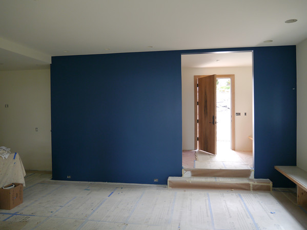

Powder room

Bedrooms
We chose not to use any paint in our bedroom, but we wanted to have a little fun in the secondary bedrooms. These two bedrooms are are nearly identical, so we wanted to use color to differentiate them. From Eve Ashcraft's The Right Color we got the idea of painting the ceiling and closet interior as a way to add color without making the color as overwhelming as it would be if all the walls were painted. We made the east facing bedroom the morning room and accented it in blues. The evening room is accented in purples.


Laundry room
Laundry rooms can be boring, so we wanted to use color to give the room some energy. We decided to do this using two accent walls in a bright coral color. Because colors tend to look brighter and lighter when painted on a wall, we went with terra rosa, which appears a bit subdued in small quantities. As the picture below shows, it's anything but subdued when you paint two walls with it.

Media room
We wanted the media room to be fairly dark so as to minimize reflection from stray light when we are watching movies. Given our palette and tradition, the obvious choice would have been bordeaux. Dark rich reds go with theaters like bright reds go with sports cars. However, one of our inspiration photos had been a dark blue room, so we decided to use the slate teal for the walls and ceiling of the media room. We paired this with dark trim to create a room that will enclose and embrace its occupants.


By using color selectively, we've been able to add some interest without taking away from the clean, refined look we are trying to achieve for the house.
No comments:
Post a Comment