Showing posts with label design. Show all posts

Saturday, October 13, 2012

Light and Space

Natural light is best for conservation and hard to beat for light quality, which is why our home has plenty of it. Artificial light is more than a necessary evil, however. It can be used to define space, and the fixtures can be beautiful details.

At the broadest level, light can be used to emphasize the social and functional structure of a home. Light should define how a space is used. Light should be usable.

So often, lighting is just an afterthought. Many spec homes have terrible lighting layout. The single ceiling light in the middle of the room comes to mind immediately. Lights are thrown in haphazardly without thought to how the rooms will be used or whether the light is sufficient. Or, perhaps, the builder does not want to dictate how the room will be used by some unknown future owner, so the light fixtures are added in a way that does not work well for anyone. Perhaps not surprisingly, the rooms with the best lighting design in standard spec homes are those that are the most specialized — kitchens, bathrooms, and dining rooms.


But how do you get good lighting? If we were to take a page from stores and office buildings, the answer would seem to be a large amount of uniform lighting. To some degree, this is a better alternative, but this approach increases functionality by making the space sterile.

Good lighting design must start with how a space will be used and work to support that usage.

Tapestry of Light and Dark (135)
  • Problem: In a building with uniform light level, there are few "places" which function as effective settings for human events. This happens because, to a large extent, the places which make effective settings are defined by light.
  • Therefore: Create alternating areas of light and dark throughout the building, in such a way that people naturally walk toward the light, whenever they are going to important places: seats, entrances, stairs, passages, places of special beauty, and make other areas darker, to increase the contrast.
  • In our home: Light is used to emphasize the main navigational points of our home. Some key examples are:
    Guiding lights in the entry
    Guiding lights on the stairs

    People also orient themselves toward the light and away from the darkness. This tendency can be used to define the social spaces in a home which we'll explore more in...

Pools of Light (252)
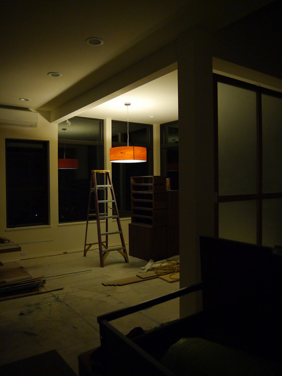
Dining room pendant

  • Problem: Uniform illumination — the sweetheart of the lighting engineers — serves no useful purpose whatsoever. In fact, it destroys the social nature of space, and makes people feel disoriented and unbounded.
  • Therefore: Place the lights low, and apart, to form individual pools of light which encompass chairs and tables like bubbles to reinforce the social character of the spaces which they form. Remember that you can't have pools of light without the dark places in between.
  • In our home: It's important to realize that this pattern doesn't mean that there should be full darkness between more brightly lit spots — although having darkness as an option provides some interesting opportunities. Our home has a generous amount of ambient lighting.
    Living room pendant
    But light should define boundaries. It should concentrate attention. And we should make sure that light defines the space in a way that is consistent with how people use it. If a brightly lit area does not correspond to a social or functional space, it will be confusing and less effective than if the light is designed around how the space will be used.

    Pools of light may be social or they may be used to provide task lighting. We have both in our home. We have task lighting in the kitchen, the bathrooms, and the dressing room. In the dining room and living room, the pendants define social spaces. These are not the only lights that support this pattern, but they are some of the key ones.

Filtered Light (238)
Filtered light in the powder room
  • Problem: Light filtered through leaves, or tracery, is wonderful. But why? ... Direct light coming from a point source casts strong shadows, resulting in harsh images with strong contrasts. ... These contrasts and hard boundaries are unpleasant — objects appear to have a hard character, and our eyes, unable to adjust to the contrast, cannot pick up the details.
  • Therefore: For all these reasons, we have a natural desire to diffuse light with lamp shades or indirect lighting, so that the images created by the light will be "softer," that is, that the boundaries perceived are not sharp, there is less contrast, fewer shadows, and the details are easier to see.
  • In our home: (I cheated a little with the problem statement and therefore. This pattern is primarily about light filtered through windows, but I chose some key points about general light diffusion.)

    One of the main ways we keep light diffuse is by having a large number of lights to provide ambient lighting. This provides a general background level of light which the pools of light shape further. The light fixtures themselves also have shades to diffuse light.

Warm Colors (250)
  • Problem: The greens and greys of hospitals and office corridors are depressing and cold. Natural wood, sunlight, bright colors are warm. In some ways, the warmth of the colors in a room makes a great deal of difference between comfort and discomfort.
  • Therefore: Choose surface colors which, together with the color of the natural light, reflected light, and artificial lights, create a warm light in the rooms.
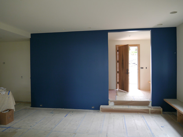
  • In our home: This pattern does not say that every surface in the house must be between red and yellow. This is a good thing, since we have a rather large teal wall in our home. However, the overall quality of the light should be warm.

    We accomplish this partly through the materials we use — that teal wall is next to a warm floor in white oak. We also accomplish this through warm light. LED lights were a particular concern here since they often give off light that is cooler than that from incandescent bulbs. We went with EcoSmart LED lights in soft white. They give a warm light quality, very similar to incandescent lights.

In the next two posts, we'll go over the details of our lighting design and then spend some time discussing the light fixtures we chose.

Sunday, September 30, 2012

Master Suite

Our master suite has an unusual design. You enter into a dressing room that combines clothes storage with sitting space and space for getting dressed. The bathroom is on one side of the dressing room. The bedroom is on the opposite side and is sized just right to fit a bed. There is no walk-in closet or access directly to the bed or sitting and writing space next to the bed. Nor is the bathroom directly connected to the bedroom. Deliberate considerations informed these choices, as explained by these three patterns.

A Room of One's Own (141)
  • Problem: No one can be close to others, without also having frequent opportunities to be alone.
  • Therefore: Give each member of the family a room of his own, especially adults. A minimum room of one's own is an alcove with desk, shelves, and curtain. The maximum is a cottage. In all cases, especially the adult ones, place these rooms at the far ends of the intimacy gradient, far from the common rooms.
  • In our home: The master suite is the private place for us. It is distinctly separate from the kids' bedrooms. It is also at the far end of the intimacy gradient, well away from the common areas. An important part of this is that the master suite is more than just bed, bath, and closet. The dressing room is also a sitting room. We will have a couple of comfortable chairs and a small table. It will be a cozy space we can retire to individually or together.

Bed Alcove (188)
  • Problem: Bedrooms make no sense.
  • Therefore: Don't put single beds in empty rooms called bedrooms, but instead but individual bed alcoves off rooms with other non-sleeping functions, so the bed itself becomes a tiny private haven.
  • In our home: While not strictly an alcove, our bedroom was inspired by this pattern. The bedroom portion of the master suite is just a bed with a pair of nightstands. It has no closets, chairs, or desks. There are two reasons it is a room instead of merely an alcove. The first is for privacy and isolation. A full room allows the bed to be separated from the dressing room, so mismatched patterns of sleeping and getting ready won't disturb the person sleeping. Secondly, a larger bed meant for two is awkward to access from only one side. A room allows a pathway and nightstand on both sides of the bed for convenience.

Dressing Rooms (189)
  • Problem: Dressing and undressing, storing clothes, having clothes lying around, have no reason to be part of any larger complex of activities. Indeed they disturb other activities: they are so self-contained that they themselves need concentrated space which has no other functions.
  • Therefore: Give everyone a dressing room — either private or shared — between their bed and the bathing room. Make this dressing room big enough so there is an open area in it at least six feet in diameter; about six linear feet of clothes hanging space; and another six feet of open shelves; two or three drawers; and a mirror.
  • In our home: The solution to this pattern is the most prescriptive of the three. It is also the one that we followed most closely. Our dressing room has a comfortably-sized open area in the center that allows easy movement. The southeast corner has two walls full of clothes storage: hanging space, shelves, and drawers. Under the windows, we have a dresser to provide more drawers. On the west wall, we will have a full-length mirror.

These patterns describe the major points of philosophy behind our master suite design. They guided us to a layout that is uncommon but surprisingly natural at the same time. We have already received many comments along the lines of “Oh! That is a good idea.” when showing off the master suite. We hope it will prove to be as convenient as the design suggests.

Sunday, September 16, 2012

Interior Color

Modern architectural style allows for two colors: black and white. That, at least, is the stereotype. But color is an important element in setting the mood of an interior, and paint is one of the cheapest ways to make a dramatic statement. We wanted to use color as a decorative element in our home.

Choosing the colors
The first step was choosing a color palette. We started with some options that our color designer put together for us. We chose a fairly complex palette: 5 colors, including Martha Stewart's Terra Rosa.


We experimented with many different combinations of colors from the choices Anne had put together for us. While there were some combinations that didn't work together, overall, we would have had a difficult time choosing a palette we disliked from the choices we had.

Eventually, we decided that bordeaux and slate teal (the main middle and right colors above), were our two must have colors. The lighter purple (dreamy) and lighter blue (saratoga springs) each on their own left the palette feeling a little unbalanced, so we decided to use both as approximately harmonious lighter shades of the purplish bordeaux and blueish slate teal. When we were onsite deciding where to use the colors, we decided to throw in terra rosa. We wanted something a little brighter and more energetic for the laundry room.

Using the colors
Once we chose a color palette, we got to decide where to use it.

Window frames
We chose to go with dark window frames on the interior. The dark trim, which matches the frame color on the exterior, both accents and minimizes the window frames. The dark trim really pops against the white walls, but it is actually less noticeable than white trim when looking through the windows at the view.

Dining room accent wall
We wanted the dining room wall to be a splash of rich color to help define the dining room as a separate region within our open space and to act as a frame for a couple pieces of frameless art that we plan to put on that wall. Our color designer, Anne, likes to always end color on an inside corner so that it doesn't feel like it suddenly died. From that, we got the idea of treating that wall as if it were a teal block penetrating the room. We even continued the color inside the entry closet to really emphasize that effect.


Powder room
We had conceived of the powder room as having a dark grey accent wall to contrast with the slightly golden tan tiles, but when it came down to choosing the wall, we couldn't decide which one to paint. Instead, we decided to take a risk and paint the whole powder room dark, ceilings and all. The effect is dramatic, but we think it works.

Bedrooms
We chose not to use any paint in our bedroom, but we wanted to have a little fun in the secondary bedrooms. These two bedrooms are are nearly identical, so we wanted to use color to differentiate them. From Eve Ashcraft's The Right Color we got the idea of painting the ceiling and closet interior as a way to add color without making the color as overwhelming as it would be if all the walls were painted. We made the east facing bedroom the morning room and accented it in blues. The evening room is accented in purples.


Laundry room
Laundry rooms can be boring, so we wanted to use color to give the room some energy. We decided to do this using two accent walls in a bright coral color. Because colors tend to look brighter and lighter when painted on a wall, we went with terra rosa, which appears a bit subdued in small quantities. As the picture below shows, it's anything but subdued when you paint two walls with it.

Media room
We wanted the media room to be fairly dark so as to minimize reflection from stray light when we are watching movies. Given our palette and tradition, the obvious choice would have been bordeaux. Dark rich reds go with theaters like bright reds go with sports cars. However, one of our inspiration photos had been a dark blue room, so we decided to use the slate teal for the walls and ceiling of the media room. We paired this with dark trim to create a room that will enclose and embrace its occupants.

By using color selectively, we've been able to add some interest without taking away from the clean, refined look we are trying to achieve for the house.

Sunday, September 2, 2012

Shaping rooms

Before we dive into the design of specific rooms, we have one last post on the general layout of the house.

The Shape of Indoor Space (191)
  • Problem: The perfectly crystalline squares and rectangles of ultramodern architecture make no special sense in human or in structural terms. They only express the rigid desires and fantasies which people have when they get too preoccupied with systems and the means of their production.
  • Therefore: With occasional exceptions, make each indoor space or each position of a space, a rough rectangle, with roughly straight walls, near right angles in the corners, and a roughly symmetrical vault over each room.
  • Room shapes on the main floor
    In our home: This pattern took us awhile to understand. The authors start by implying rectangles are bad and end by saying rooms should be roughly rectangular! The key to understanding this pattern lies in the discussion between the Problem and the Therefore.

    This pattern is all about making rooms feel comfortable. What shape should a room have? The room should be convex. Concave corners feel awkward unless they define a separate space such as an alcove. The room should pack well with other rooms. Unless it's an exterior room, this almost always means that the corners will be roughly 90 degrees. These two constraints lead to roughly rectangular rooms.

    Room shapes upstairs
    But why the hate for crystalline squares and rectangles? Rooms should be rough rectangles, but they don't have to be exact. They don't have to follow strict proportions (e.g., square, golden ratio) or relate in such a way that a perfect grid could be laid over the floor plan. The rooms should dictate their shapes, not some imposed ideal.

    Our home is made up of rough rectangles, freely arranged and mostly free from non-alcove-defining concave borders. Rooms were sized and placed based on their functionality, not according to any system.

Corner Doors (196)
  • Problem: The success of a room depends to a great extent on the position of the doors. If the doors create a pattern of movement which destroys the places in the room, the room will never allow people to be comfortable.
  • Therefore: Except in very large rooms, a door only rarely makes sense in the middle of a wall. It does in an entrance room, for instance, because this room gets its character essentially from the door, but in most rooms, especially small ones, put the doors as near the corners of the room as possible. If the room has two doors, and people move through it, keep both doors at one end of the room.
  • In our home: We don't have a lot of doors in our home, but their placement in the room generally makes sense functionally — mostly in corners and, when not, placed in a way that makes sense for the individual rooms. Instead of highlighting all of our doors — you should be able to find them yourself from the floor plan (main, upper) — we want to focus on a particular room where, guided by this pattern, we moved a door to make the room much more effective.

    Our dressing room is fairly small space (roughly 10' x 12') that has three doors. Placing the doors without creating dead, unusable spaces proved to be something of a challenge. The architect had originally placed the doors as pictured below on the left. This turned most of the south wall (the lower wall, in this image) into a pathway and made the south east corner difficult to use. We ended up losing about half the room to pathways.

    After framing (but, thankfully, before much else was in), we realized how awkward this would be. We modeled the room in Sketchup and tried different door placements. It quickly became clear that the placement in the image on the right is much more usable. The path still divides the room — this is inescapable given the placement of the rooms, but it divides the room into two areas large enough to be useful. The area in the lower right, which is along interior walls, will be our dressing corner (the large brown boxes are shelving). The area in the upper left, which is near the windows, will be a sitting area. There is a bit of an awkward corner in the upper right, but it fits my dresser perfectly.

    As this example illustrates, the door placement can make a huge difference in the usability of a room.

Dressing room doors, before
Dressing room doors, after

Sunday, August 26, 2012

Decks and Green Roof

Decks and patios can be just as important to a house as the main rooms. If properly designed, they too act as rooms of the house. Like interior rooms, they should connect logically to the rest of the house, and to attract people to them, they must be spacious and laid out properly.

The obvious place for a deck is outside the living room to the west. It is easily accessible from the main floor and looks out towards the view. We made it about the same size as the living room, nestled into the corner of the stair tower.

The second natural deck location is the roof of the garage. This temptingly large surface is roughly level with the second floor. Following the Roof Garden pattern, the space is divided into a green roof and a deck. A built in bench provides a nice sitting space. The deck portion was designed lower than the green roof, giving a sense of sitting in the greenery.


Several patterns helped guide our design:

Outdoor Room (163)
  • Problem: A garden is the place for lying in the grass, swinging, croquet, growing flowers, throwing a ball for the dog. But there is another way of being outdoors: and its needs are not met by the garden at all.
  • Therefore: Build a place outdoors which has so much enclosure round it, that it takes on the feeling of a room, even though it is open to the sky. To do this, define it at the corners with columns, perhaps roof it partially with a trellis or a sliding canvas roof, and create "walls" around it, with fences, sitting walls, screens, hedges, or the exterior walls of the building itself.
  • In our home: Both of our decks are designed as outdoor rooms. The main deck mirrors the living room in position and size. It has a railing that feels comfortably enclosing, but still leaves a connection to the wider outdoors. Its placement gives it some of the best views in the house, while directly connecting it to the main social spaces. It will be easy and attractive to move from the living room to the deck when the weather allows. It has a natural gas outlet available so we can use a grill out there in the future.
    Dark window trim frames the view
    The upper deck is a private room. It is enclosed by the building wall on one side and the back of the bench on the other. It has a bit of roof overhang to enclose it, too. The location off of the master bathroom and laundry room makes it easily accessible for the family. The bench and green roof make it an attractive place to spend time.

Six-Foot Balcony (167)
  • Problem: Balconies and porches which are less than six feet deep are hardly every used.
  • Therefore: Whenever you build a balcony, a porch, a gallery, or a terrace always make it at least six feet deep. It possible, recess at least a part of it into the building so that it is not cantilevered out and separated from the building by a simple line, and enclose it partially.
  • In our home: The main deck off the living room is about the same size of our living room. It sits in two corners of the house to achieve a recessed feel.

    The upper deck is wider but not as deep as the lower deck. It is about 10' deep, including the bench. Being above the garage, it feels tightly attached to the rest of the building.
    Opposite deck rail

Roof Garden (118)
  • Problem: A vast part of the earth's surface, in a town, consists of roofs. Couple this with the fact that the total area of a town which can be exposed to the sun is finite, and you will realize that it is natural, and indeed essential, to make roofs which take advantage of the sun and air.
  • Therefore: Make parts of almost every roof system usable as roof gardens. Make these parts flat, perhaps terraced for planting, with places to sit and sleep, private places. Place the roof gardens at various stories, and always make it possible to walk directly out onto the roof garden from some lived-in part of the building.
  • In our home: The biggest accessible roof space in our house is above the garage. We split that into a roof garden and a deck. The roof garden is a green roof system from GreenFeathers. Plants are grown in modules at the company's nursery for several months. Once the plants are established, they are transported to our house. The modules are placed on the roof, and the liners are removed to connect the sections together. It is designed for our climate and should need almost no maintenance. During the hottest days of summer it will need a bit of hand-watering; but otherwise will take care of itself. We have the largest green roof in the development so far, and we went with some deeper modules. The deeper modules allow larger plants to grow, including some that will turn in to small bushes. There are a variety of plants to provide variation in height, color, and bloom time. The layout includes some terra cotta stones to provide access to all parts of the garden.
    Green roof established after three weeks
    The deck next to the green roof provides a sitting (and even sleeping) space. It feels tightly integrated with the plants, placing a garden at your back as you sit on the bench.

    The other major part of our roof is the butterfly top. It is not so easily accessible, so we did not add a deck or garden up there. To make it potentially usable space in the future, we ran a conduit from the electrical box to the roof. This will allow us to easily add solar panels on the roof when we desire.

From layout, we moved to materials. Ipe is a popular wood for decks. It is weather resistant, and turns a silvery color over time. Yuval prefers batu. It is also weather resistant, cheaper than ipe, and has a rich red color. The warm color provides a contrast to the cool colors of our house, and Seattle's typical cool, cloudy weather.
Rooftop deck, finished and stained (but still drying)

No deck is complete without a railing — no safe deck, at least. Like the other houses, we chose a slatted design using the batu. The vertical posts are powder-coated steel. Originally we considered stainless steel. Eventually, we decided to use a darker color to match the interior window trim. That helps to make the posts disappear and lets attention be drawn to the view. For similar reasons, we went with a horizontal strip of batu on the top of the railing instead of a cylindrical steel tube.
Deck rail, finished

We're happy with how the decks and green roof turned out. They are warm, comfortable, and inviting places. We should make good use of both decks (when the weather allows).

Sunday, August 19, 2012

Interior flow

The high level zones of our home were largely determined by our desire to have common areas at the heart. The intimacy gradient and treatment of natural light as well as the general constraints of the site helped determine the more detailed layout.

But the success of a layout turns on how rooms are connected to each other. Today's post will explore how we approached movement through our home.

The Flow Through Rooms (131)
  • Problem: The movement between rooms is as important as the rooms themselves; and its arrangement has as much effect on social interaction in the rooms, as the interiors of the rooms.
  • Therefore: As far as possible, avoid the use of corridors and passages. Instead, use public rooms and common rooms as rooms for movement and for gathering. To do this, place the common rooms to form a chain, or loop, so that it becomes possible to walk from room to room — and so that private rooms open directly off these public rooms. In every case, give this indoor circulation from room to room a feeling of great generosity, passing in a wide and ample loop around the house, with view of fires and great windows.
  • In our home: The purpose of this pattern is to enhance social interaction. As the pattern describes it,
    The possibility of small momentary conversations, gestures, kindnesses, explanations which clear up misunderstandings, jokes and stories is the lifeblood of a human group. If it gets prevented, the group will fall apart as people's individual relationships go gradually downhill.
    To encourage this sort of casual bonding, circulation areas should be used to help connect people to each other in the public parts of the home. Even private areas should not be fully separate from the flow of people.

    In our home, the main public areas are on the main floor. Although the bedrooms upstairs and the media room downstairs are fairly isolated from the main floor, both floors are situated to encourage passing through the main floor. The floors are connected by a single open staircase, so moving from one region to another provides social connection.

    The image below highlights the circulation pathways on the main floor. They are adjacent to living areas without going through those areas. One particularly interesting — and unintentional — detail is the relationship of the main entry to the stairs. People cannot go from the main entry to the private bedrooms upstairs without making some contact with the common area, but the pathways are generous and tangent enough that that interaction can be as brief or lingering as desired.

Short Passages (132)
  • Problem: “... long, sterile corridors set the scene for everything bad about modern architecture.”
  • Therefore: Keep passages short. Make them as much like rooms as possible with carpets or wood on the floor, furniture, bookshelves, beautiful windows. Make them generous in shape, and always give them plenty of light; the best corridors and passages of all are those which have windows along an entire wall.
  • In our home: We only have passages in two places: the stairway itself and the upstairs landing. The stairway is fairly long, but the u-shaped path and the open design make the space feel more compact. It has some of the best windows in the house, and we intend to add window seats on the landings.

    The upstairs landing has more difficulties. To its benefit, it shares the windows from the stairs, is fairly short and generously sized. To its detriment, it has an opening on each of the four sides, making it harder to treat as a room. We should be able to fit some furnishings in the southwest corner of the landing, but that will be made somewhat harder because the door to the south bedrooms is a sliding door mounted on the wall.

    In both of these cases, we have passages with potential, but they'll require care to really become spaces that contribute to the feel of our home rather than detracting from it.


Setsuzokuya is meant to be a home which connects people. By centering the house around a common heart, we hope to achieve that ideal.

Sunday, August 12, 2012

Front Door

The front door doesn't need to be particularly special for an entry to be successful. It needs to be of good quality; it needs to be visually set apart; but it doesn't need to be elaborate.

That said, we wanted our front door to be something special. We wanted it to set the tone for the rest of the house: refined, simple, elegant, well designed, natural. Like the other houses in our development, we had our door designed by Christopher Lindsley, a local craftsman (who, with the commission of several dining room tables and a number of other pieces, is quickly becoming the woodworker for our development).

Designing a door is an odd process. Because of the time it takes to create the piece, and because it is nice to have a door on the house by the time you start leaving valuables inside, door design starts before a lot of the other decisions have been made. The door should set the tone of the house, but when we started designing the door, we only had a high level idea of what that tone would be.

Our first concept played upon the L-shape motif that we used on our stair tower. We envisioned something with two L's in smoky glass in a field of dark and driftwood grey wood. This initial concept had some problems. In addition to not leaving a good spot for a door handle, it felt more geometric than we wanted.

Chris talked us out of this basic concept, but we did like some of the basic ideas: light and dark contrast and a sense of flow and motion. Chris and Yuval worked with us to shape this into a couple of different designs. One, shown below, used a shifting stair step to give a sense of dynamic flow. Another option really built on the "tetris piece" theme of our initial concept and involved a lot of different sized pieces covering the door. Both of these could have been quite striking, but we eventually went a different direction. These ideas were neat, but they didn't seem quite right. Plus, when it came down to it, finding the right combination of wood to balance the sense of dynamism and simplicity was difficult. Even a single variety of wood has such variety in color and grain that combining that variation with a lot of small pieces became noisy.

We were somewhat stuck at this point. Our second design meeting ended at something of an impasse. Everyone liked different parts of different ideas, but nothing really captured our imagination. Fortunately, before our third meeting, Chris had an inspiration which took our door in a completely different dimension.

Our final design combines a simple but weighty door with a substantial surround and deep casing to evoke (but not slavishly copy) a Japanese temple gateway. The strong horizontal line of the fascia enhances that effect. The crisp but natural design evokes the aesthetic we use throughout the house with the woods providing a preview of the materials that will be encountered inside.

Eventually, the surround will be stained dark to increase the contrast with the door (the sides of the surround already are).

The downside of this design is that we gave up a bit of functionality for aesthetics (in that sense, the door isn't representative; usually we drop aesthetics before functionality). Notice the complete lack of windows by the entry. Entry windows are great for letting you take a peak out when someone comes by (is it an unwelcome solicitor?). They are also something of a security feature. In the end, we decided it was something we could live without to get the look we desired.

From the inside, the door looks more standard. The white oak door is surrounded by unstained white oak casing and adorned with a simple dark bronze handle. To add more interest, we choose to use a piece of white oak with some personality.


Overall, we are really happy with the way our door turned out. Later, we'll look at how it fits into the rest of the entry sequence.

Sunday, August 5, 2012

Driveway and Hardscaping

The exterior concrete and aggregate for the house is poured, so the hardscaping is nearly finished. Only a bit of clean-up is left.

Three areas outside the house needed concrete: the entry, the driveway, and the north side of the house (a fairly steep slope shared with our neighbor which needed retaining walls to control erosion).

The relationship between the garage, driveway, and entry was informed by this pattern from A Pattern Language:

Car Connection (113)
  • Problem: The process of arriving in a house, and leaving it, is fundamental to our daily lives; and very often it involves a car. But the place where cars connect to houses, far from being important and beautiful, is often off to one side and neglected.
  • Therefore: Place the parking place for the car, and the main entrance, in such a relation to each other, that the shortest route from the parked car into the house, both to the kitchen and to the living rooms, is always through the main entrance. Make the parking place for the car into an actual room which makes a positive and graceful place where the car stands, not just a gap in the terrain.
  • In our home: It was natural to have the main entry and the garage entry be in the same location. But to really nail this pattern, we chose to forgo any separate garage entry into the house. Whether coming from the garage, driveway, or street, you always come through the same front door. Right now, the driveway is more of a gap in the terrain than a positive and graceful place, but we are going to use landscaping to remedy that (as our neighbors have already started doing to good effect).

Poured driveway
On to the details. The driveway was constrained but straightforward. It connects the private drive to the garage. Due to the hill, it slopes downward. We asked for as smooth a transition as possible to accommodate any low-slung sports cars we may own in the future. The top of the driveway curves north a bit to reduce the elevation change. To add interest and break up the linearity, we continued the curves on the south side of the driveway. A strip drain at the bottom of the driveway will catch water from the garage and driveway.

Entrance hardscape
The entry hardscape provides access from the driveway, garage, and street. A landing at the top joins the driveway and the steps from the street. A wide and long set of shallow steps descends to the front door. A second, less grand set of steps leads from the garage side door and stays under cover of a canopy which will keep us dry when going from the garage to the house.

Entry prepped for pouring
There is a lesson hidden in these stairs: don't be fooled by false economies. We had poured an earlier concrete foundation before the steps were fully designed. There ended up being a few conflicts between the foundation and the final aggregate. In the end, some chunks of concrete had to be chiseled out, and a few of the foundation walls are still visible. They will be cleaned up and finished a bit more before construction is complete. It might seem easier/cheaper to do something earlier (like pour concrete when the truck is going to be onsite for other work), but doing so before design is complete either constrains your design or forces you to undo a bad decision.

Curve on the south side of the drivewayEntry and driveway forms are different than foundation forms. The entry and driveway are wide, thin slabs. The forms are simple boards, with flexible strips forming corners and other curves. The concrete is poured and smoothed, then the top layer is removed to expose the aggregate. This gives a more interesting look and doesn't show wear as much as smooth concrete would.

Graded pathway
The north side of the house looked more like a traditional foundation. This space has the potentia to be a nice area between our house and the neighbor's, but it is rather steep and, without care, would just be a hazardous hill of dirt. Our initial plan was for concrete retaining walls with an aggregate stairway. It would stabilize the slope, give some area for landscaping, and provide a functional path to the backyards. This work would benefit both homes and straddle the property line, so we agreed to split the cost evenly. It was a lot of excavation and concrete work, however, so we ended up scaling back the original design. The retaining walls were the most important part, so those were completed as-designed. The dirt was backfilled around them to stabilize the slope. Later we will add a pathway, but it will probably be a simpler landscape-style pathway with some gravel and wood treads, instead of a full aggregate path.

Landscaping will go around the hardscape a bit later. Plants and softer, less permanent pathways will be added to connect the sidewalk to the entry landing. Much of the landscaping work can be done after move-in by us as we develop the design and actuality of the landscape. The hardscaping is the messier and more difficult work, and it was valuable to complete it along with the rest of construction.

Sunday, July 29, 2012

Exterior Design and Colors

The exterior is finally painted, and other than a few touch-ups, the exterior design and color is fully finished. Let's compare what we ended up with to our original plan and inspirations.

SIding painted

This picture gives the best evidence of the look we were trying to achieve. The garage has larger panels, and the dark grey stands in contrast to the light grey lap siding on the rest of the house. Details such as the windows, roof fascia, and deck edging, are in a dark color to provide an accent.

The charcoal frame of the windows was the first piece in place. Those were ordered when construction started, and installed back in February.
Trial fascia trim in dark bronze
Fascia & cap. More brown than originally planned...
The fascia around the edge of the roof was installed in April and May. We were limited by the colors available in the metal, so we decided on a dark bronze. It was just shy of black to avoid too stark of an accent, with just a touch of warmth from the bronze.

Unfortunately, this didn't quite work out. The dark color of the metal highlighted the flex and imperfections in the metal due to the height of the fascia. After some trials of different installation techniques and different materials, the roofing contractor decided to use a thicker metal. This cut down on the warp and flex of the metal, giving a smoother look. However, the colors in this metal were different than our original colors! The fascia ended up with more brown in it, as an espresso color.

At the time, we decided this would be acceptable, as the color was not directly next to the charcoal of the window frames.

The paint colors are the largest applications of color and really define the look of the house. 'Dark grey' and 'light grey' and not specific — there are thousands of varieties of grey in all different shades. Colors look different under different light and against different colors. Not only do we have the window trim and the fascia to compare against, but we have the reddish wood on the deck, and the neighboring houses. The house directly next to ours has a blue theme, while the first house has a bit more of a bluish-grey style; but the house across from ours (which is not painted yet) is aiming for more of a brown/cream palette.

In our original design meetings, well before construction had started, we had picked out a couple of candidate pairs of colors. One was a bit cooler, and the other was a bit warmer, but they were fairly close together. These were not chosen under realistic conditions; the samples were small and the light artificial. Once we painted these on some pieces of siding to compare against the window trim, deck wood, and neighboring houses, it was clear neither pair were right for us. The cooler pair was noticeably blue against the window and decking. The warmer pair was noticeably brown against the other houses (in fact, one of the shades matched the dry dirt around the house rather well).

We took another look, and came up with two more palettes. The first was Dovetail and Dorian Gray. The second pair was Attitude Gray and Unusual Gray. The Dovetail/Dorian pair was a touch warmer, and was a good match for the existing colors. However, it matched a bit too closely, and ended up looking bland.

The Attitude/Unusual pair has a bit of a green undertone. It works with the rest of the colors, but gives a more interesting look. The green pairs well with the trees and foliage around the house, but the colors are still grey enough to appear as such to the casual observer.

Full-sun shot of paint

The surprise came once the paint was applied. The colors look good, and we're pleased with them. However, there is large variability in how the color is perceived. In bright sun, the light color is a nice light shade of grey, almost a bit cream-colored; while the darker color has a noticeable green tint.

Light paint on the siding

In shadow, the lighter color darkens up noticeably, but gains a bit more green.

South face painted, (both parts of siding are the same color)

Right next to each other with some sun, the lighter color gains a touch of blue.

Light against dark

Overall, a bit more contrast between the colors in the shade would've been nice (as shown by our initial inspiration picture), since Seattle isn't known for its abundance of sun.

The other problem at this point is the fascia. It is noticeably browner, especially when compared to the various accents painted to match the window trim.

Dark trim of door against brown of fascia

Ultimately we think it will be OK, but we're tweaking the colors near the entry to prevent too harsh a comparison between the various shades.

At this point, the exterior of the building is largely done. There are still some details left — deck rails, stain around the door, a little more trim paint — but after that, it will be more or less in its final shape!