We are working on interior design, starting with materials and colors. We started by visiting tile show rooms. On the first trip, we browsed. On the second trip, we picked out samples. There are a lot of nice tiles, but the vast majority in the showrooms are neutral: white, black, grey, and brown. A few come in red, a few in metal, and glass comes in a wide range of colors. So when we saw a lovely blue tile, we investigated further. The people at the Statements showroom referred us to their commercial/builder showroom. We got a nice selection of blue tiles, mostly from the Italian company FAP.
Next we reviewed our finds with Yuval and saw the samples he had picked out for us. We didn't make a lot of decisions, but we identified several more samples we wanted to get to prepare for the second meeting. Then we brought in Anne Viggiano, the color designer Yuval works with. This meeting was really good, and we came out with some specific material choices for different rooms. Yuval took some nice pictures of the material combinations for reference, which we have below.
The Bathrooms
Erika and I had a vision for the bathroom. Our favorite counter material was Deep Ocean CaesarStone, and we thought it would pair well with lacquer white cabinets. We wanted to continue the blue theme from the Amour Mer tile by FAP, although we weren't sure where. We paired that with a grey floor tile and some naturally-shaped flat stones for the shower floor.
Anne and Yuval helped us tie everything together. Anne suggested using the same stones we liked for the shower floor for the backsplash to give it a more organic, rounded-ragged edge. The stones pair nicely with the rough-edge maple Yuval suggested for the bathroom bench. Ecotech tiles provide the grey we wanted for the floor as well as some natural texture that would be less slippery when wet.
We decided to use the Amour Mer tiles in the shower so that they would tie into the blue of the counters without competing. The shower will be mostly glossy white tiles with some vertical strips of the blue.
These materials will provide a nice balance between the clean, modern counters, cabinets, and shower walls and the natural stone and wood in the floor, backsplash, and bench.
After discussing all this, we moved on to the main level, where we had only a vague idea of what we wanted...
Saturday, May 14, 2011
Sunday, April 17, 2011
Inspiration: Water
Water, always changing, has a beauty and energy that fixed elements rarely duplicate. When the sky is bright and clear, it will match. Under clouds it looks dim and grey. At night, it can disappear. Gazing through clear water gives a strong sense of depth.
Lit at night, water takes on the color of its container and the light. It distributes the light and color, creating a plane of light in the dark. The difference between day and night can be dramatic.
Still water reflects the surroundings like an imperfect mirror. In the dim evening light, it may be difficult to tell which image is reflection and which is reality.
Still water can look like a sheet of glass. A pathway that crosses water focuses your care and attention on the water and the process of entering.
Flowing water provides an ever-changing appearance. It is a natural, shifting piece that catches the eye and ear with pleasant noise.
Pictures from:
The Vivienda 19 House by A-cero
Concrete House by A-cero
Water Features by H2O Designs
Saturday, April 16, 2011
Appliances
The kitchen takes more design than most rooms, and you can't finalize a kitchen design without choosing the appliances. Accordingly, we recently spent a weekend (and then some) choosing appliances.
The easy choices
Our builder recommended Bosch where applicable. We did not have strong preferences on the dishwasher, refrigerator, washer, and dryer, so we chose low- to mid-range Bosch items. Yuval recommended Waste King garbage disposals, and so we chose a reasonable unit from their selection.
This brings us to the oven and cooktop. We spend more time interacting with these appliances, and that leads to more detailed requirements.
Ovens
We wanted double wall-mount ovens. A speed oven seemed like a perfect fit for the second oven. It would eliminate the need for a separate microwave and be smaller, faster, and more efficient. There was just one problem: Bosch does not sell a speed oven in the US.
Miele makes a popular, high quality speed oven. However, a speed oven and matching full-size oven from Miele is about $2000 more than a Bosch double wall oven plus separate microwave. With a $10,000 appliance budget, this is a big deal.
Fortunately, Yuval pointed out that the high-end Bosch microwave is actually a combination oven. The difference is that the Miele speed oven is an oven first, microwave second, and can use both kinds of cooking methods together. The Bosch combination microwave is a microwave first, oven second, and can only use the cooking methods individually. We combined this with a full-size oven to accomplish our main goals: no separate microwave and a smaller secondary oven. This came in about $2400 cheaper than the Miele combination.
Cooktop
We chose a 36" gas cooktop. We considered induction, but it is more expensive and the unit we saw had confusing controls. Gas is also what we are used to. A 36" cooktop will give us five or six burners, one or two more than the standard four.
We considered three different cooktops:
Because our stove is going on the island, we needed an island mount hood. It needed to be at least 42" (6" wider than the cooktop) and be powerful enough to match the stove. We chose a 48" Kuppersbusch hood with 725 CFM of air exchange. That is more power than we need, but it is a good price and fits our needs. If it is more powerful than needed, we can use it on the lower (and quieter) fan speeds.
Totaling it up
The total cost for all of the appliances came out to about $10,000. It's only a bit over the initial budget we had set. With those settled on, we can freeze one part of the budget and finalize the kitchen design.
The easy choices
Our builder recommended Bosch where applicable. We did not have strong preferences on the dishwasher, refrigerator, washer, and dryer, so we chose low- to mid-range Bosch items. Yuval recommended Waste King garbage disposals, and so we chose a reasonable unit from their selection.
This brings us to the oven and cooktop. We spend more time interacting with these appliances, and that leads to more detailed requirements.
Ovens
We wanted double wall-mount ovens. A speed oven seemed like a perfect fit for the second oven. It would eliminate the need for a separate microwave and be smaller, faster, and more efficient. There was just one problem: Bosch does not sell a speed oven in the US.
Miele makes a popular, high quality speed oven. However, a speed oven and matching full-size oven from Miele is about $2000 more than a Bosch double wall oven plus separate microwave. With a $10,000 appliance budget, this is a big deal.
Fortunately, Yuval pointed out that the high-end Bosch microwave is actually a combination oven. The difference is that the Miele speed oven is an oven first, microwave second, and can use both kinds of cooking methods together. The Bosch combination microwave is a microwave first, oven second, and can only use the cooking methods individually. We combined this with a full-size oven to accomplish our main goals: no separate microwave and a smaller secondary oven. This came in about $2400 cheaper than the Miele combination.
Cooktop
We chose a 36" gas cooktop. We considered induction, but it is more expensive and the unit we saw had confusing controls. Gas is also what we are used to. A 36" cooktop will give us five or six burners, one or two more than the standard four.
We considered three different cooktops:
- The Bertazzoni Professional cooktop looks the nicest, but we were less fond of the mechanism for lighting the burner, and the simmer does not seem as good.
- The DCS cooktop has a nice simmer using a separate ring on all burners and a wonderful lighting mechanism. It costs slightly less than the Bertazzoni.
- The BlueStar drop-in cooktop costs the most and has an industrial look some may dislike. It has a nice lighting mechanism, good simmer on all burners (and one simmer-specific burner), more powerful burners (two at 22,000 BTU), and a knob layout arranged to match the burner layout. The burners use an open burner design which should provide more even heating.
Because our stove is going on the island, we needed an island mount hood. It needed to be at least 42" (6" wider than the cooktop) and be powerful enough to match the stove. We chose a 48" Kuppersbusch hood with 725 CFM of air exchange. That is more power than we need, but it is a good price and fits our needs. If it is more powerful than needed, we can use it on the lower (and quieter) fan speeds.
Totaling it up
The total cost for all of the appliances came out to about $10,000. It's only a bit over the initial budget we had set. With those settled on, we can freeze one part of the budget and finalize the kitchen design.
Monday, March 28, 2011
Pictures
We finally got around to setting up a gallery for photos of our house. We've got just a few for now — some pictures of the land before construction starts.
Back in September when we purchased the land, much of it was a big pile of dirt from the excavation of the neighboring houses.
By February, the dirt had been mostly cleared away as the neighboring foundations were completed and backfilled. This picture shows the main area that our house will be built. It is taken from the east edge, roughly in the driveway. The black fence marks the start of the critical slope where we can't build; that will be near the edge of the usable section of our backyard; we actually own the land for about the same distance again down the hill.
This is the buildable area, shown from near the edge of the backyard (before the hill starts sloping and becomes wild). The pile of lumber is roughly where our driveway will be.
This picture gives an idea of how long our lot is, and how much it slopes. I'm taking this picture at the south-west corner of our property; Erika (one of the black blobs in the middle) is near where the previous picture was taken. All the area between us is part of our land, but will be left mostly wild. The dirt trail will eventually be cleaned up by the city; hopefully they'll add in some stairs.
This picture is near the south-east corner of our property, where the street connects. Erika is down near the north-west corner of our backyard (on the right by the tree).
There are a few more pictures of the site. You can view all the site pictures, or view all the galleries for our house, which will be updated as we add some more pictures.
Sunday, March 27, 2011
Windows!
We have been working on a number of things in the past month, and we finally have something finalized to report on — windows. Window planning took several rounds of design and feedback, but was relatively easy from our perspective. The initial design was mostly good. We had a few comments, but most of the changes were suggested by Yuval and Markus to accommodate structural changes (a beam was added in the living room, which interfered with some of the windows) or to improve usability or decrease cost.
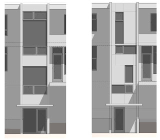
Our main point of concern was the stair tower. The initial design featured large windows over most of the west wall to take advantage of the views. These ended up being the most expensive windows, and we found the design kind of boring. In the spirit of Zen Views, we asked for less window and more interest.
Markus came up with a design which really delighted us. Wide windows punctuate the stair landings, where you can pause to take in a wider view. Vertical windows make for a dynamic view — descending from the top floor to the main floor, you see out from the highest point down towards the trees and water; ascending from the bottom floor to the main floor you see up towards the trees and sky. Going the other directions, you just have a small bit of horizontal window at the landing to focus on. From the outside it looks interesting but intentional (plus it reminds us of Tetris pieces, which is awesome).
The original design is on the left, the final design is on the right.
The rest of the windows were straight-forward. We have plenty of openable windows to get good air circulation throughout the house (look for the dotted Vs). The living room has lots of windows on the south and west to take advantage of the view and bring lots of light into the main floor. This is important since the dining room and kitchen do not have any exterior walls of their own to put windows in.
Now that the windows have been finalized, permitting should start shortly. We are working on kitchen design, and choosing appliances and plumbing fixtures (faucets, sinks, toilets, etc.). All the while, we are starting to analyze the budget and make sure our choices stay within it. We have been busy, but we'll post more as we finalize our choices.
Sunday, March 6, 2011
Roof Form
As of a couple weeks ago, we still needed to decide on a roof form. After looking at different forms from different perspectives and in context of the other houses, we made a decision.
The two shed variants were eliminated fairly quickly — we weren't as fond of how those looked, either in isolation or with the other houses. The choice was between flat and butterfly. We liked the way the flat roof looked in isolation, but it didn't fit as well with the community (the rest of the homes have butterfly roofs). We decided to go with a butterfly roof. It matched the other houses and still looked good on ours. It also adds visual interest to the strong horizontal lines on our exterior.
Here's how the butterfly roof looks in the context of the neighborhood. In the top portion of this image, our house is the right-most one; in the bottom portion, it is the left-most.
We currently have lots of other things in process. Windows are being finalized, kitchen design has started, and plans for permitting are being worked on. It is keeping us busy, but there is nothing finished to report on quite yet.
Monday, February 14, 2011
Final Floor Plans
We have finalized the floor plan. The big decision centered around the layout of the upper floor. Initially, we had planned to put the master suite on the east side and the other bedrooms on the west.
This layout gives the master suite good light and access to the rooftop deck, but we disliked the layout of the other bedrooms. They did did not feel connected, and we felt that this pattern lacked a Children's Realm (a pattern which Erika is going to write about soon). We discussed adding a play loft over the stairs to connect the rooms. It would be a cool and unique feature, but it would negatively impact the view out of the stair tower on the upper floor, where we would have the longest views. Markus gave us a diagram with sight lines to show the impact. The dotted lines in the upper left represent the play loft. As you can see from the sight lines, there would be no view from the stairs on the upper floor if we had a play loft.
We considered the alternative of moving the master suite to the north and the other bedrooms to the south. This puts the bathroom for the secondary bedrooms right between those rooms and adds a bit of circulation space which strongly connects them into a children's realm.
This layout has some disadvantages. Going through the utility room to the deck is a bit awkward. The second bathroom is slightly smaller. The master dressing room is a bit smaller, and we have a bit more unnecessary circulation space in the master bedroom. The master suite also has less eastern light (although it will have more light throughout the day).
However, we decided that having a cohesive space for the children and preserving the western views out the stair tower were important. We can shift the deck to give access both from the utility room and the master bathroom. We hope that with access to the deck though the less private laundry room, it will get more use, since children and guests might feel strange going through our room to get to the deck.
The layout of the main floor has not changed much from the first sketches with western stairs. This level contains the main social spaces and our office. We are starting to flesh out the details left out of that initial sketch.
The exterior entry porch lies several steps below the garage and ground level (a couple feet). It has benches on both sides to increase the sense of enclosure and make the entry feel like an outdoor room. The fireplace is going to be open on three sides so that it can act as a visual connection between all of the social spaces on this level.
Downstairs is mainly the media room. We are aiming for the full home theater experience: raised platform to support two rows of seating, acoustic isolation, and few to no windows. We will install the plumbing for a future downstairs bathroom, but for now we will leave that as storage space. The lower level has access to the backyard, although you have to descend another half level to access it.
The total size is about 2700 sqft. It's a bit bigger than the 2500 sqft we had settled on (and much bigger than our initial goal of 2000 sqft), but we like the way everything came out, and feel that it is still an efficient layout with a lot of functionality packed into the space.
Our next steps, other than the already mentioned roof form and fenestrations, are working on mechanical systems, especially HVAC, looking at and choosing materials, and kitchen design. This will be the point where Yuval's expertise will go from useful to invaluable. We hope to have everything needed for permitting finalized within the next four to six weeks. Permitting will take another six weeks (during that time, we will work on design aspects which don't effect the permitting process). Hopefully, we will start construction in mid-May!
Subscribe to:
Posts (Atom)